
How dashboard can help to analyze communications?
PR News, a Russian communications research company, shares its experience with dashboards and expertise in making data in the world of communications and PR accessible and understandable.
Creating something simple is a true art. A dashboard is a format that makes data easy to comprehend, helps organize it in a clear language, and acts as a graphic medium for easier analysis. It presents one of today’s most relevant and valuable tools in communications. With more and more data generated, while we have increasingly less time to process it all, he who can make the difficult easy, wins.
At PR News, we use dashboards on a regular basis for media analyses (monthly, quarterly, etc.). A short version of data allows going back to the full archive to see key details when necessary. Dashboards come in handy when you need to visualize research or a case, present social media analytics at an event or data to the chief executive, to name a few.
Here we share with communications and PR practitioners how to use this format.
Visualize and Analyze
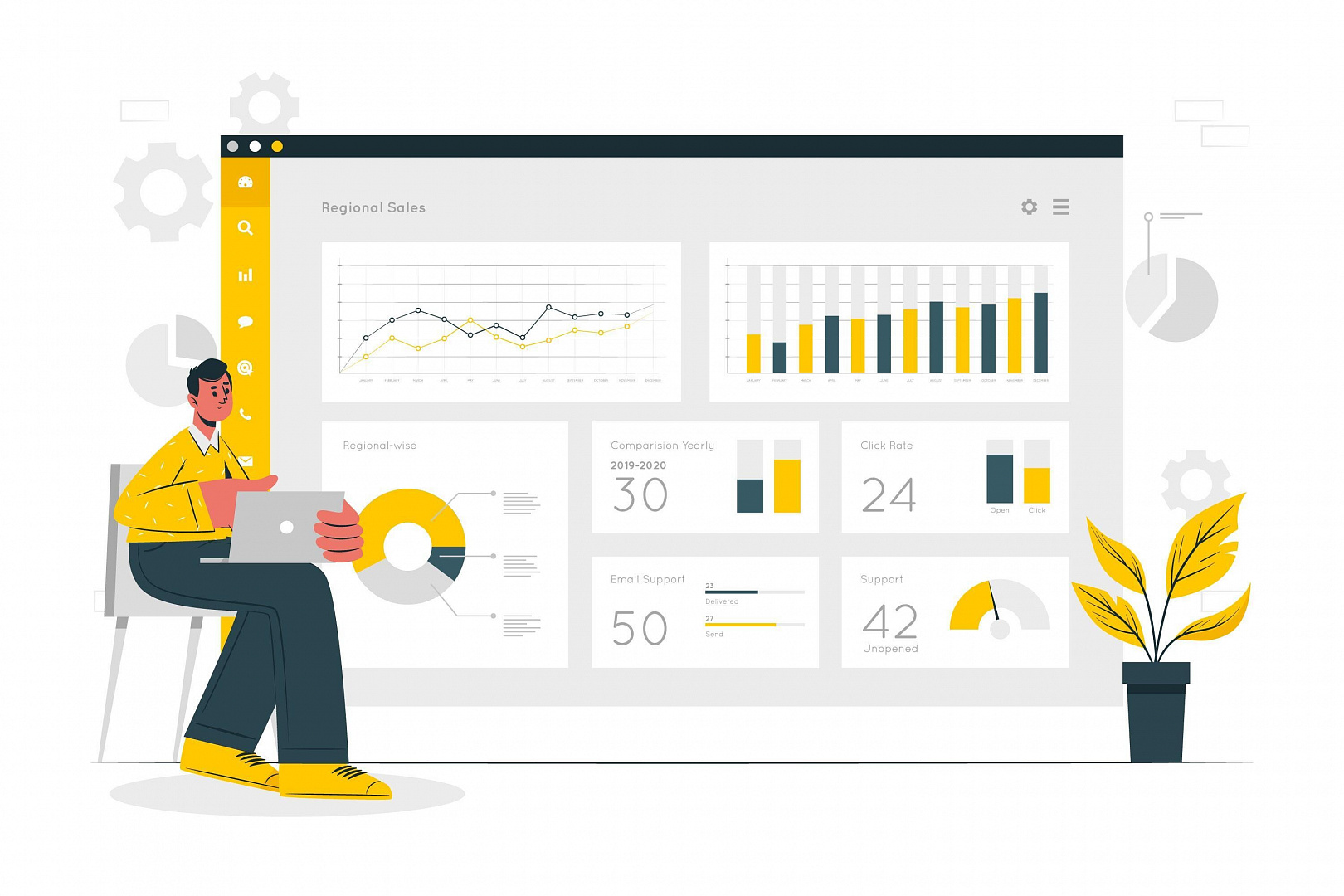
What is dashboard?
Simply speaking, it is a graphical user interface utilizing tables, diagrams and the like to visualize key data. But what makes the dashboard special is that while visualizing data, it also helps analyze them and draw conclusions. In other words, it displays data in full scope, helps you identify the key pieces and, most importantly, see what changed. This is what distinguishes the dashboard from infographics (which can be part of a dashboard) whose purpose is to show, not analyze.
How and when to use dashboards?
Dashboards can be used for purposes of analysis in any industry, for example, to estimate patient flows in a hospital or employee salaries at a large company, monitor social media or see whether customers are satisfied with a new telecom service. They help manage data instead of drowning you in it – use them to structure information for easier processing and understanding.
Dashboards offer a universal format for analyzing data. But finding the necessary software and using it is not enough to create a dashboard. Before that you need to collect and structure data, identify key pieces and set goals. In other words, you need to make bits of information useful and find out how they can help you.
How to create a dashboard?
Dashboards are built using the same rules that apply to data visualization, UX and storytelling. What do these tools have in common? Caring about users. You need to present information in such a way that makes clear to users where these data come from, what they say and what conclusions can be drawn from them. It is an art that is worth learning by taking one or two courses in data management.
There are many programs for creating dashboards on the market, with new ones coming out all the time. Google has Google Data Studio and a collection of widgets in Google Analytics. Microsoft has Power BI and there are other platforms like Qlik, Tableau, etc.
At PR News, we use a variety of services, depending on the task. For example, we used Tableau software which offered us tools to show a lot of data in a condensed form, while also demonstrating what the survey was about and showing key takeaways.
The rules of creating a good dashboard
- All data must fit on one screen. An interactive dashboard must have tabs for users to switch between different sets of data.
- Composition is important. Make sure the information presented is easy to assimilate. For example, the most important pieces of data should be placed in the upper left corner of the window where most people intuitively look first, and the arrangement of blocks of data should follow the left-to-right direction.
- Use contrasting elements, bright colors, large fonts, etc. to draw attention to what is important but avoid overdoing it, so that it is clear what takes first place and what comes after that.
- Just showing data is not enough. Explain where they come from or compare data for different periods to demonstrate change.
Advantages of dashboards in PR and communications:
- Analytics is a language understood by executives. Dashboards translate the language of communications into the language of business. This format makes the two good partners and you someone who can speak both tongues.
- Dashboards offer a way to communicate large amounts of information quickly and also ease its use. They help clients take important decisions faster because you already did all the necessary analysis for them.
- Use dashboards for conferences, presentations and other events to capture and hold the attention of the audience even if you speak about something very complex.


